Your journal
Journal identity and appearance
Use General settings to manage your journal's identity. Use Appearance settings to choose a theme and adjust its colors, header, typography, spacing, and corners. The live preview shows your changes before you save them.
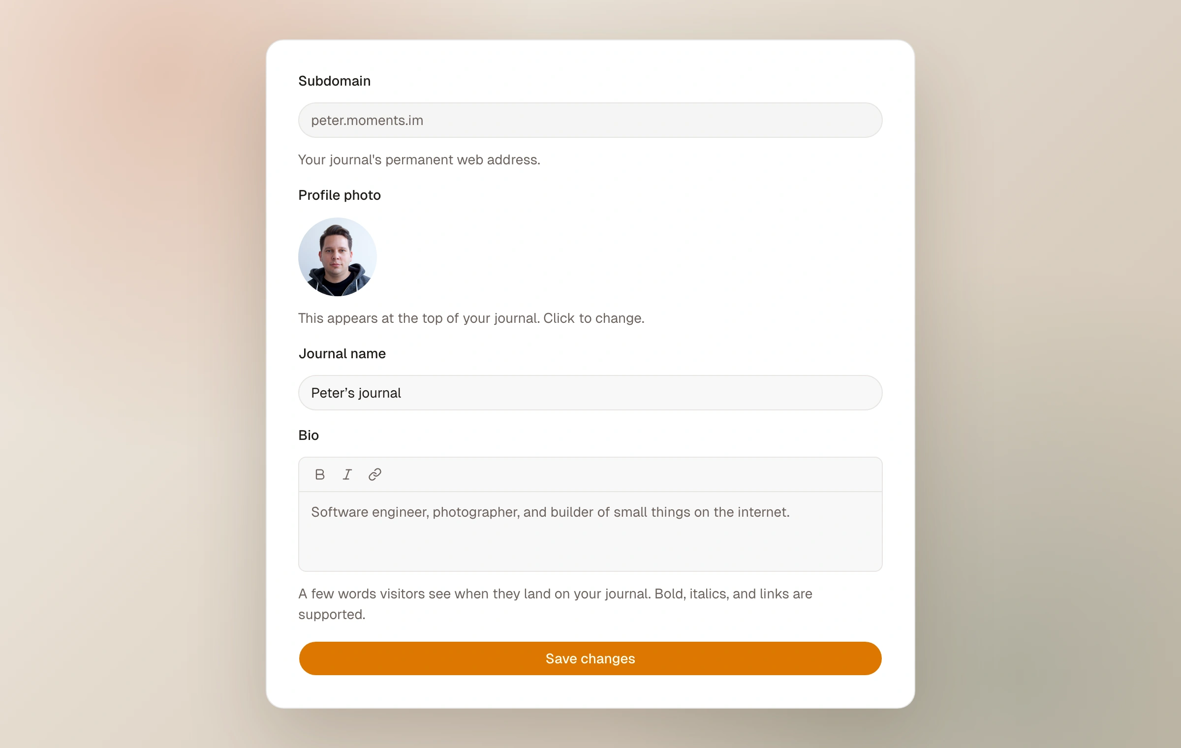
Name, portrait, and bio
General settings contains the journal name, profile photo, and bio. The bio supports basic formatting and links.
Your moments.im subdomain remains the journal's permanent platform address. Connecting a custom domain adds another address without removing the original one.
Start with a theme
Classic, Clean, and Bold are available on every plan. They provide different fonts, spacing, borders, and color treatments.
The nine Moments Plus themes are Full Frame, Essay, Contact, Edition, Sequence, Safelight, Exhibit, Pixel, and Postcard. Each has a more specialized page layout and photo arrangement. Anyone can try these themes in the preview, but saving one requires Moments Plus access.
Choosing a theme does not publish a change immediately. Review it in the preview, then select Save changes.
Choose an accent and color mode
The accent controls links, buttons, and other highlights. Each theme also uses the accent to generate compatible background, text, and border colors for light and dark mode. Selecting the theme's default accent keeps that choice tied to the theme; if you switch themes, the new theme can use its own default.
Reader's choice follows each visitor's device setting and shows a light/dark switch in the journal footer. Always light and Always dark use one mode for everyone and remove that switch. These settings are available on every plan.
Customize the header
You can upload a JPEG, PNG, or WebP hero image up to 10 MB and choose which part of it stays in view. A wide image of about 2000 pixels works well. Removing the image returns the header to the theme's background.
The Background setting controls the header effect when there is no hero image. Profile photo controls whether the photo is hidden, small, regular, or large. Alignment controls the position of the name, profile photo, bio, and navigation.
The journal adds a dark overlay behind text when a hero image is present. Check both preview modes to make sure the text remains readable with your image.
Adjust typography, spacing, and corners
Typography settings control the heading font, body font, heading size, and heading weight. Fonts chosen from the list are loaded from Google Fonts automatically. Selecting the theme's own option removes your override, so future theme updates can change the default.
Spacing controls the vertical distance between moments and sections. Photo spacing controls the gap between images. Corners controls the shared corner radius used by photos, buttons, tags, and other theme elements that read that variable.
All fine-tuning controls are available on every plan. They write CSS variables into a marked block in Custom CSS. You can inspect or edit that block directly, and resetting a control to the theme's own value removes its override.
Preview, save, and use custom CSS
The desktop preview can switch between light and dark mode and between desktop and mobile widths. The full-page preview opens in a new tab and includes unsaved changes. Your published journal changes only after you select Save changes.
Custom CSS loads after the selected theme, so matching rules in your stylesheet take priority. The editor shows the current theme stylesheet for reference when you have not written custom CSS. If you edit the theme stylesheet itself, that edited copy becomes your custom stylesheet.
Fine-tuning CSS can be saved on every plan. Saving other hand-written CSS requires Moments Plus access. If Moments Plus access ends, hand-written CSS and the selected Moments Plus theme remain saved but are not applied; fine-tuning settings stay active. They are restored when access returns.
When custom CSS is active, selecting another theme sets the CSS aside so the new theme can be previewed. Use the Your own CSS card to restore it. Nothing changes on the published journal until you save.
Keep reading
Related guide
Customize your journal with CSS
Use CSS variables and stable selectors to customize your journal beyond the Appearance settings.
Related guide
Begin a photo journal
Create a home for your photographs, choose its address and character, then publish your first moment.
Related guide
Pages and journal navigation
Add About, Gear, Contact, portfolio, or guide pages and build a clear header around them.
Related guide
Use a domain you own
Connect a domain or subdomain, complete DNS verification, and understand what happens to existing links.